Power Apps Custom Components
Neil Haddley • July 13, 2021
Create reusable Power Apps Components.
New component library
I navigated to https://make.powerapps.com/
I selected the "Apps" menu item and selected the "Component libraries" tab.
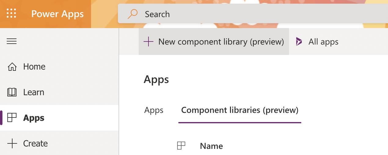
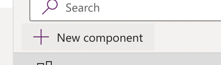
I clicked the + New component library button
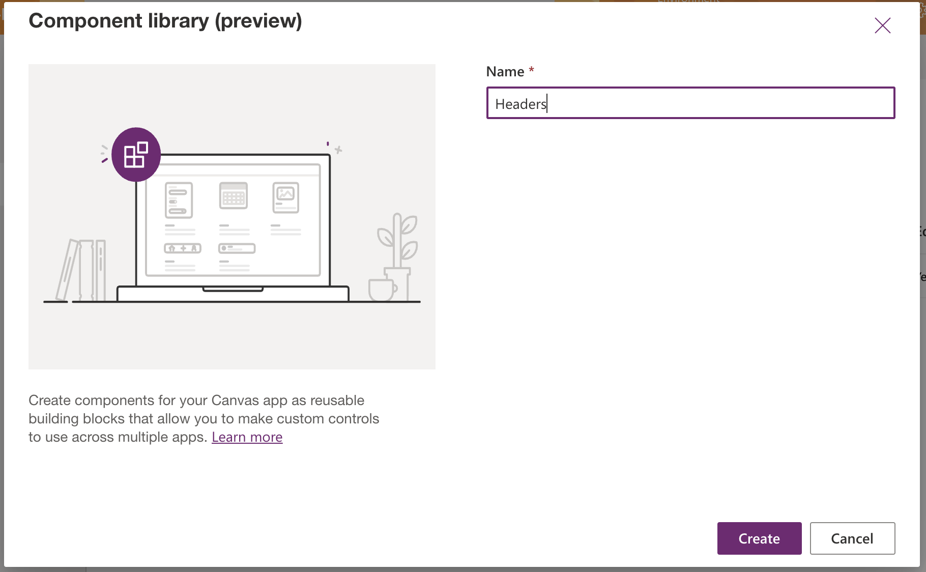
I named the library
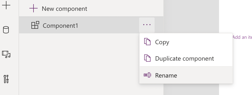
I renamed the sample component
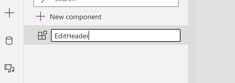
I named the component "EditHeader"
I added a second component
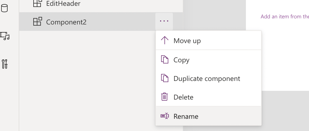
I renamed the second component
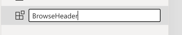
I named the second component "BrowseHeader"
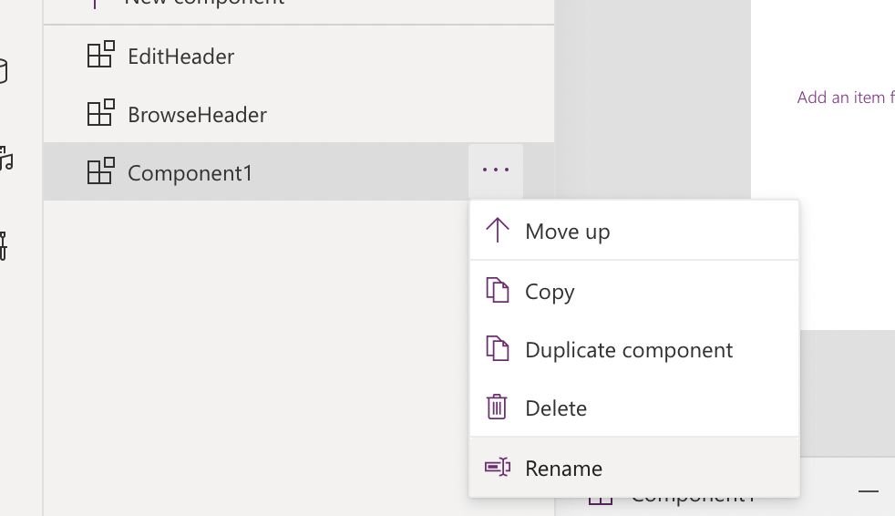
I added a third component
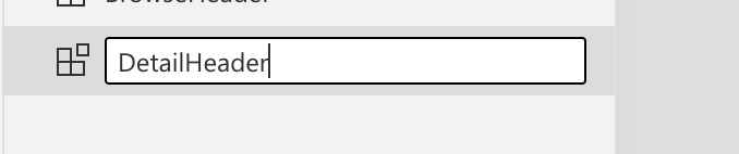
I renamed the third component "DetailHeader"
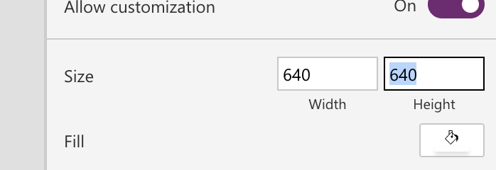
I set the height of all three components from 640 to 88
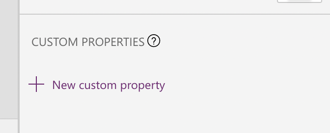
I added a custom property to the EditHeader component
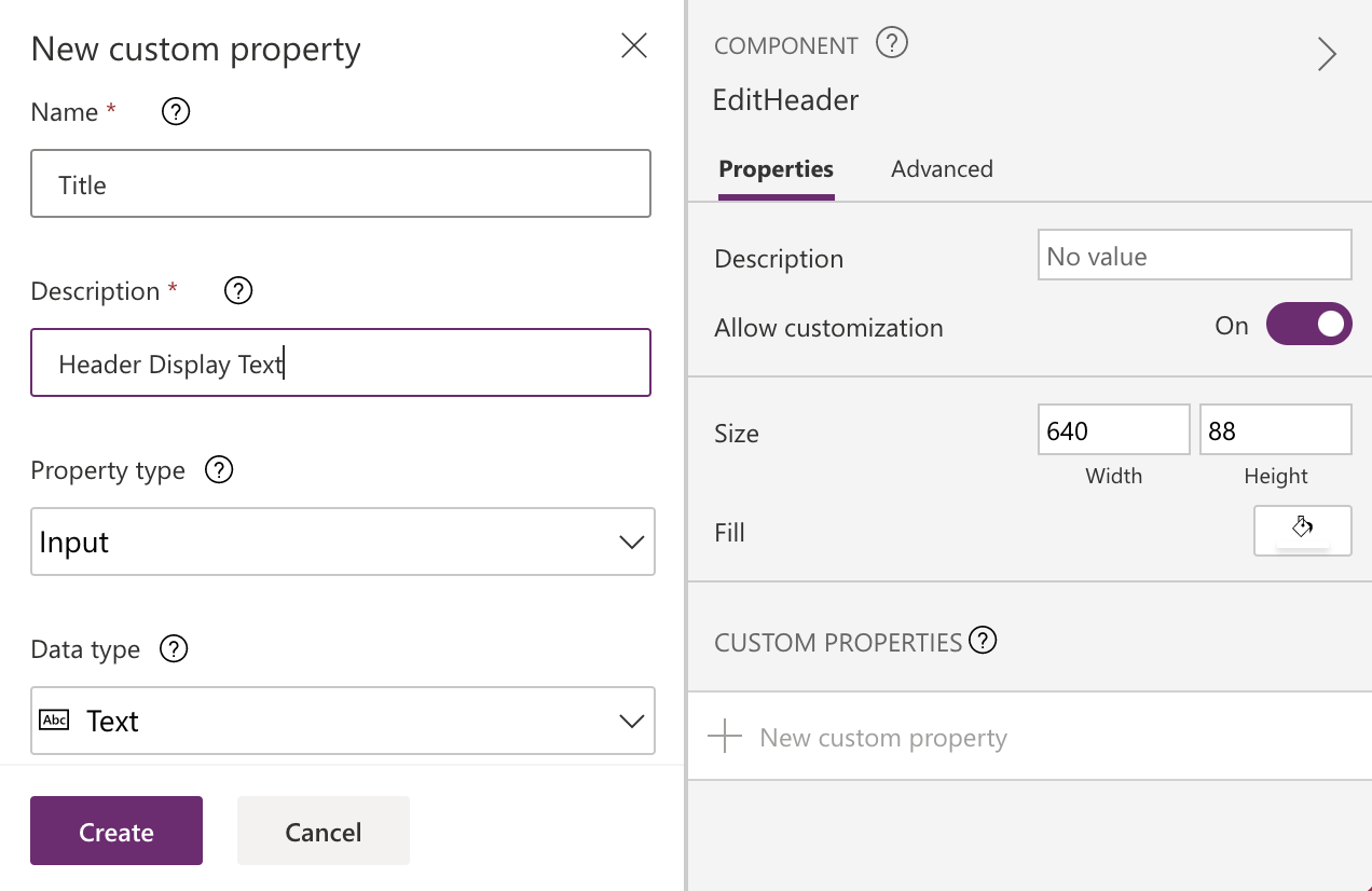
I named the Input property Title
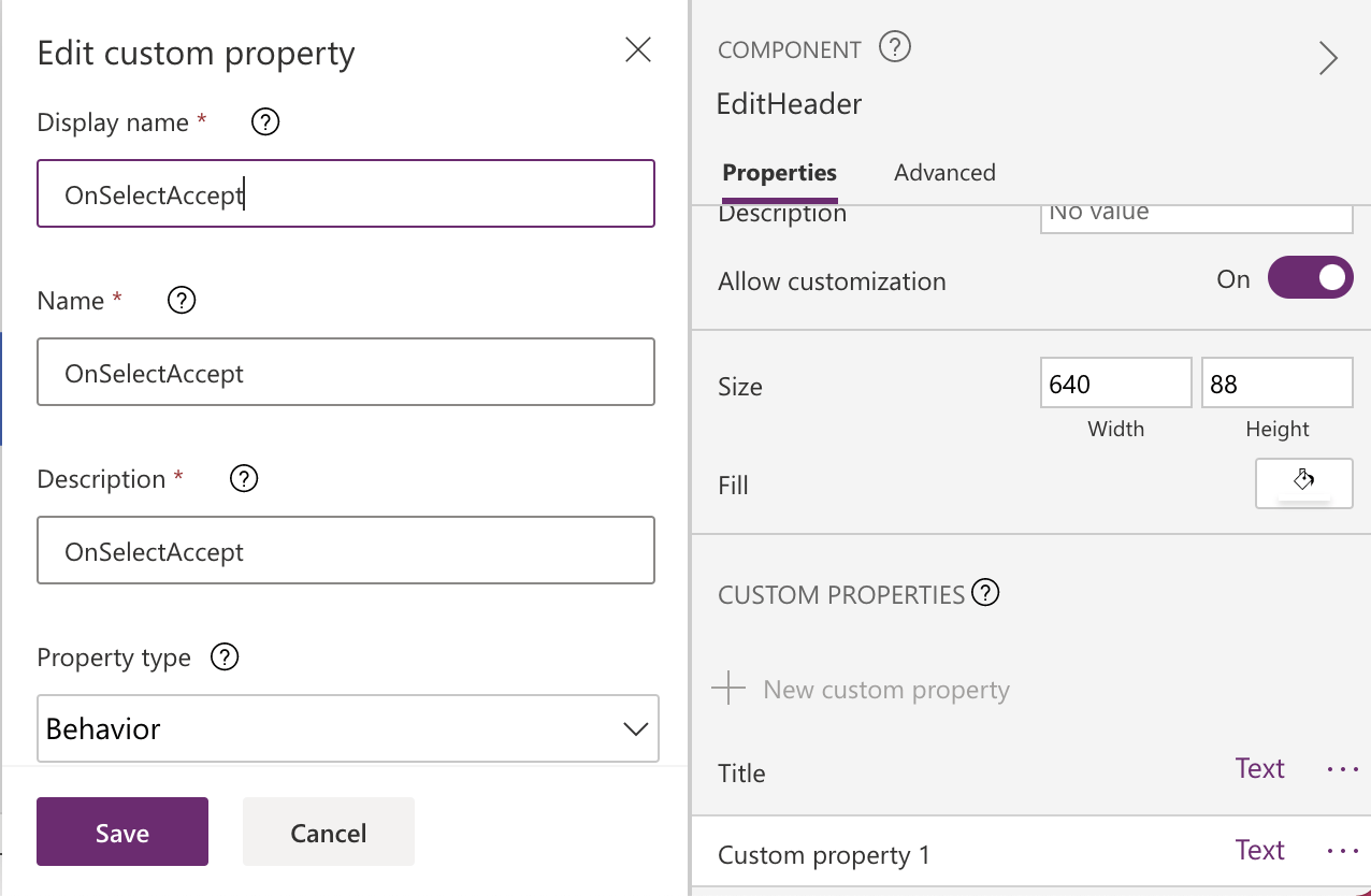
I added an "OnSelectAccept" custom Behavior property
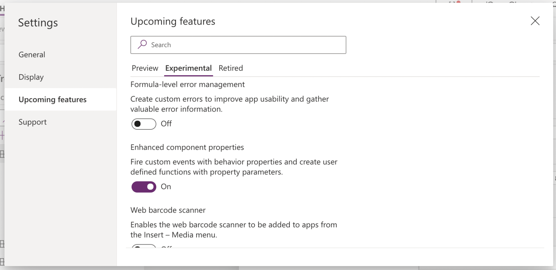
I enabled "Enhanced component properties" in the settings dialog
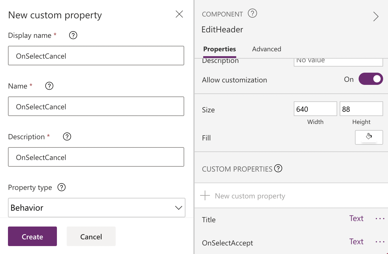
I added an "OnSelectCancel" custom Behavior property
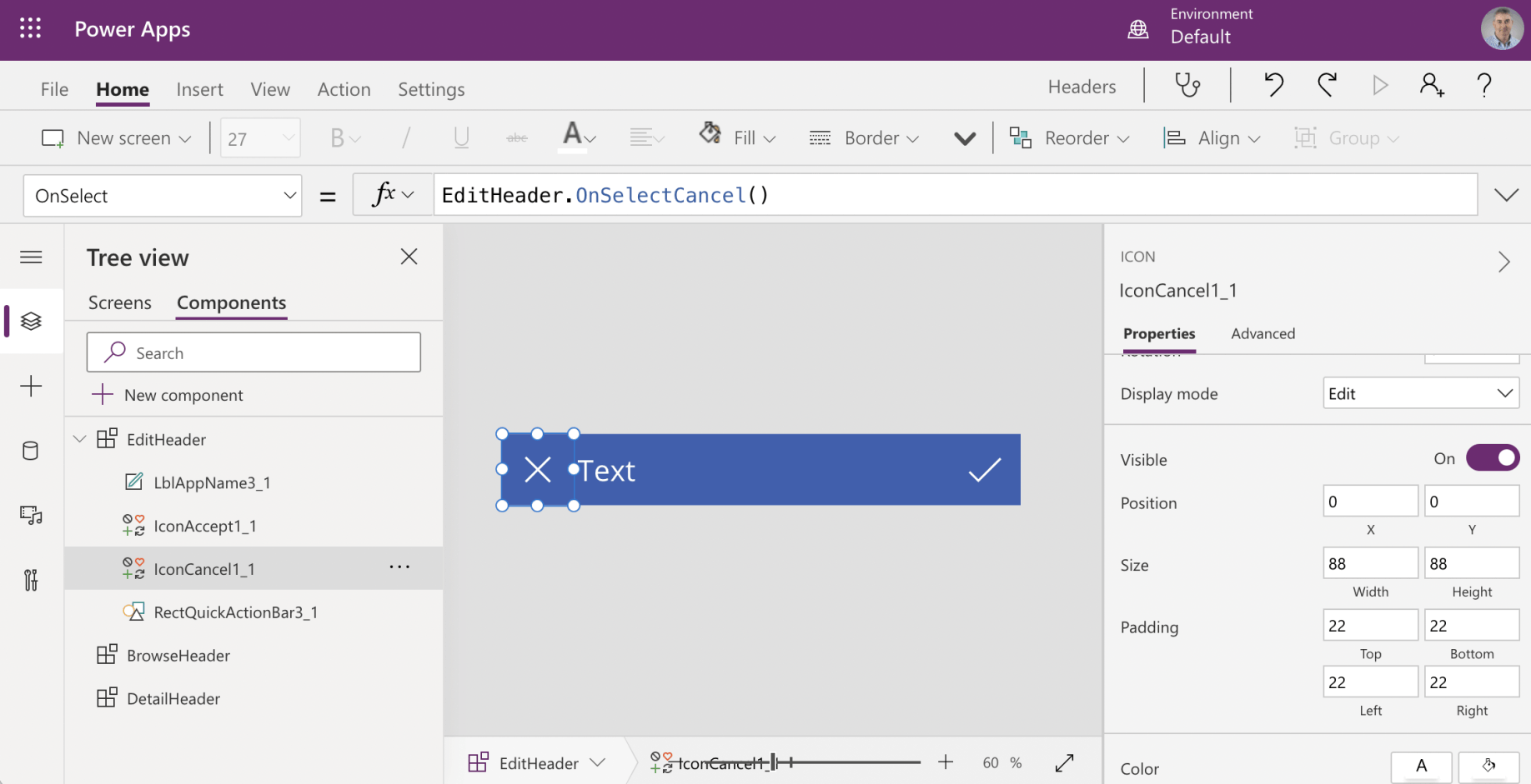
I selected the IconCancel control and edited the OnSelect property so that selecting the cancel icon raises the custom OnSelectCancel event
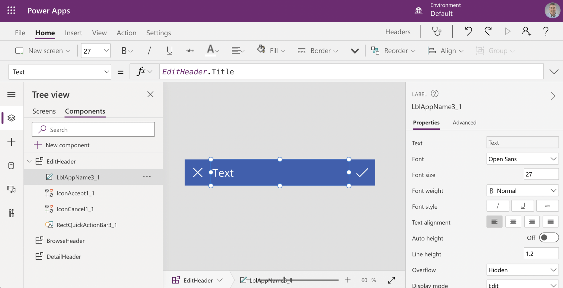
I selected the AppName control and edited the Text property so that the value of the Title property is copied to the label text
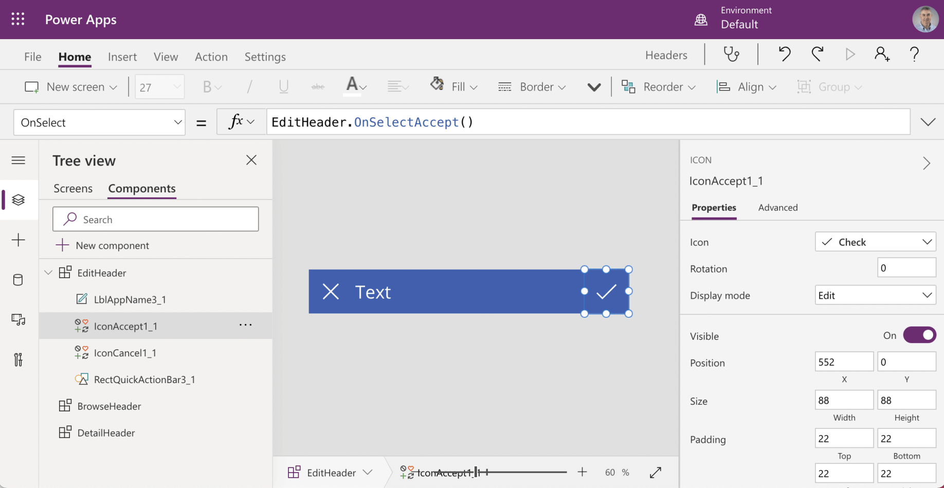
I selected the IconAccept control and edited the OnSelect property so that selecting the tick icon raises the OnSelectAccept event
Repeat these steps for the BrowseHeader and DetailHeader Components
I added these custom properties to BrowseHeader:
{Title, OnSelectRefresh, OnSelectNewItem, OnSelectSortUpDown}
I added these custom properties to DetailHeader:
{Title, OnSelectBack, OnSelectDelete, OnSelectEdit}
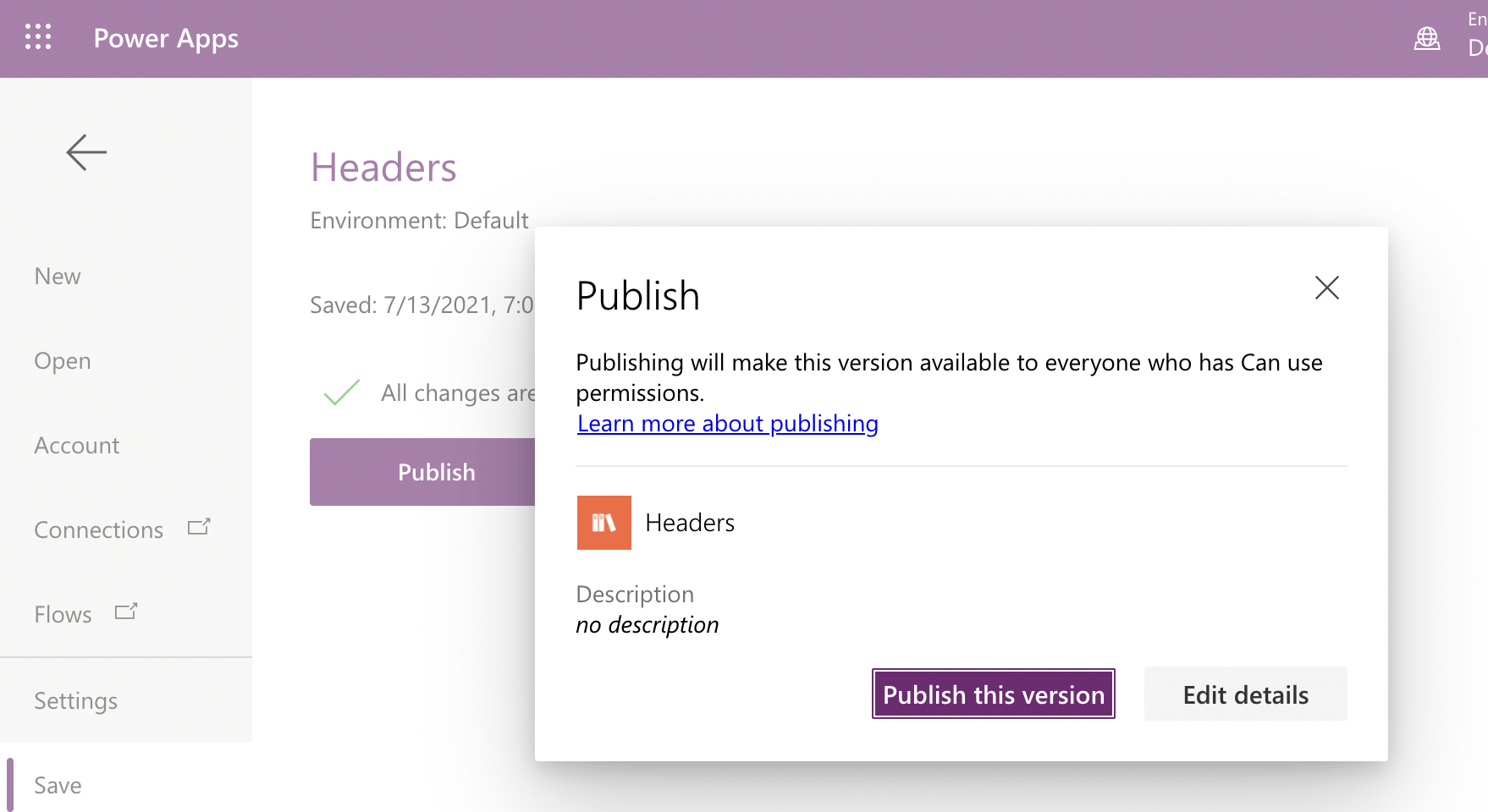
I published the component library